

Total Inventory Value by Product
Use the dashboard pie chart to see how much of your cash is currently tied up in inventory for each product.
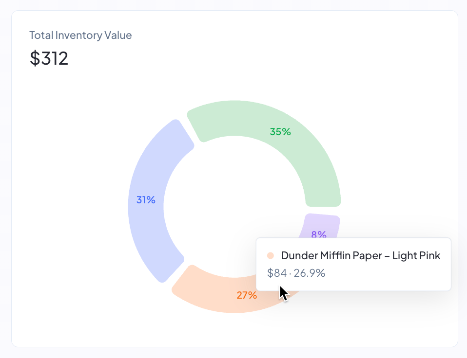
The Total Inventory Value chart on your dashboard shows where your inventory cash is locked up right now, broken down by product. The headline number above the chart is the total cash currently sitting across all your on-hand inventory, and each slice of the pie represents one product's share of that total. Use it to spot which products are eating the majority of your working capital so you can prioritize what to reorder, slow down on, or run promotions on.
Where to find it
The chart sits on your dashboard, to the right of the Inventory Value Over Time bar chart. The two charts share a single row, with the bar chart taking the left two-thirds of the width and the pie chart taking the right one-third.
How the value is calculated
For each product, Profit Hawk multiplies the product's current on-hand units by its current manufacturing cost per unit.
On-hand units include:
- Units in Amazon fulfillment centers
- Units on active inbound shipments to Amazon
- Units in any external warehouses you have connected
Manufacturing cost per unit comes from the Manufacturing Cost column on the product's Product Costs table, using the cost entry with the most recent effective date that is on or before the current date.
The headline total above the chart is the sum of every product's current cash tied up.
The "Total Inventory Value" total counts the manufacturing cost portion of your landed cost only. Shipping, prep, import, third-party logistics, and other cost categories are not included in this chart. For the full landed-cost picture per unit, see Product Costs.
How products are grouped
To keep the chart readable, Profit Hawk shows the top 10 products by cash tied up as individual slices. Every other product is rolled into a single Other (N) slice, where N is the count of products grouped together.
Each slice and legend row shows:
- The dollar amount of cash currently tied up for that product
- The percent of your total inventory cash that product represents
Why the chart ignores the dashboard period selector
The dashboard period selector (30 days, 90 days, and so on) controls trend metrics measured over a window of time. The Total Inventory Value chart is a point-in-time snapshot of the cash currently sitting in your inventory, so a date range does not apply. The numbers always reflect right now.
Improving the accuracy of the chart
The chart is only as useful as the data it draws on. To get an accurate breakdown:
- Make sure every product has a manufacturing cost entered on its Product Costs page. Products with no manufacturing cost on file cannot appear in the chart.
- Keep your external warehouse quantities up to date. See External Warehouses.
- Connect every sales channel that holds inventory you want included. See Amazon Seller Central.